Six Degrees Dance Company
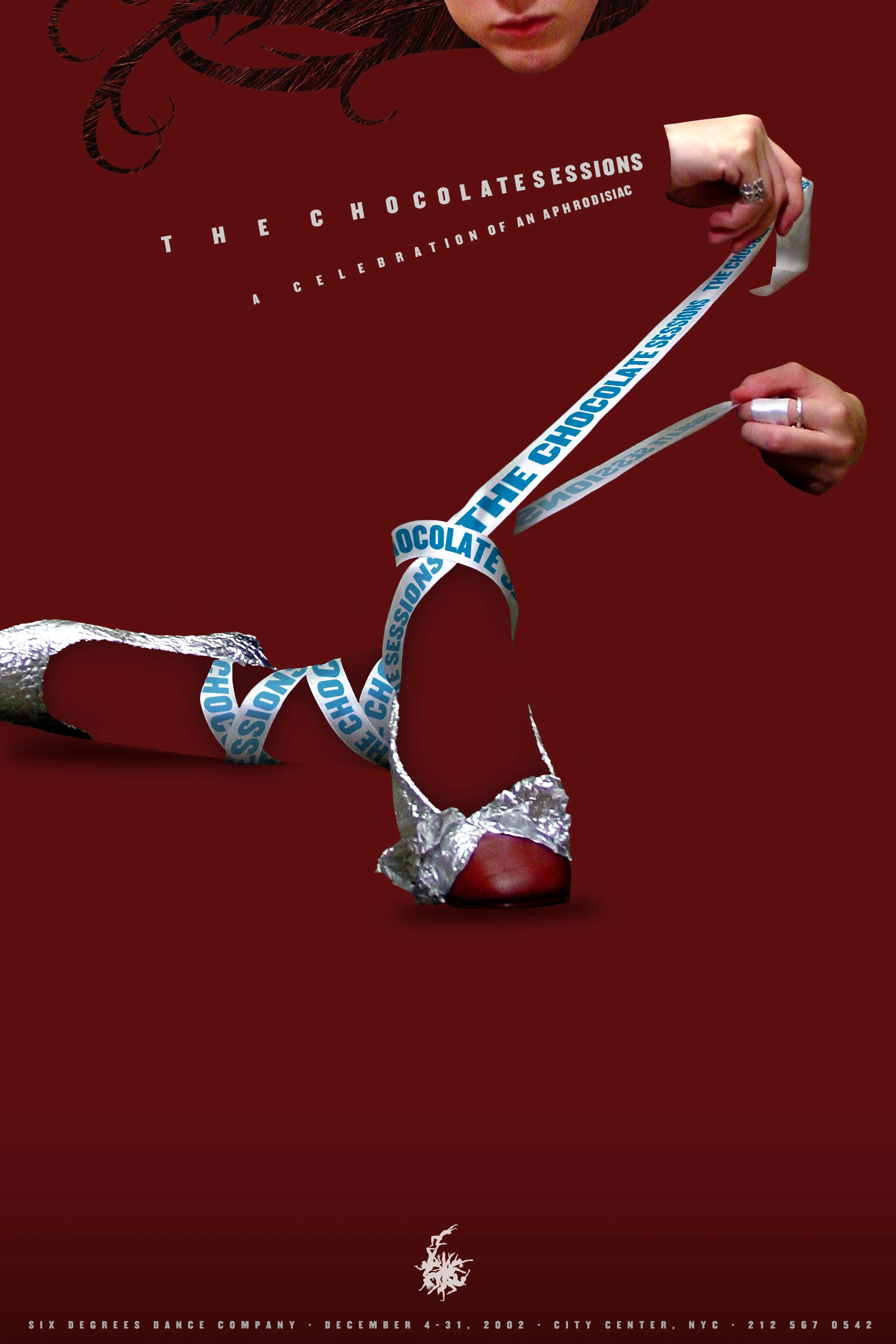
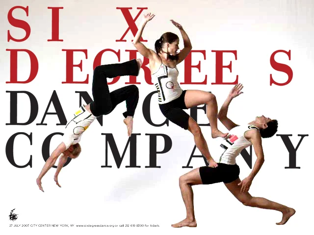
There's a long held myth within the design community that logos must be simple. But for Six Degrees Dance Company, Polemic turned that myth on its head, creating a radically complex mark that at the smallest scale managed to still read as both people and the number six. At larger sizes, the intricate details of the dancers—hair follicles, fingernails, toes—created an authentic texture.
This approach also allowed the company to leverage their mark as an illustration. Dramatically cropping their logo in random ways created program covers, merchandise, and marketing promotions.
In addition to its silhouetted mark, Polemic also developed a fluid use of typography, which captured the motion of modern dance in a rather literal way.